DaVita.com Website Style Guide
Brand Colors
Below is a listing of the DaVita brand palette for use on the web and the SASS variables/hex associated with each color.
WCAG Color Accessibility Spreadsheet
Neutral
-
$color-black
#000 -
$color-grey
#414141 -
$color-grey-medium
#7d7d7d -
$color-grey-light
#b2b2b2 -
$color-grey-pale
#dfdfdf -
$color-grey-lightest
#efefef -
$color-white
#fff
Blue
-
$color-blue-primary
#0069b1 -
$color-blue-light
#00a8e4 -
$color-blue-dark
#004c80 -
$color-blue-darker
#283764
Yellow
-
$color-yellow
#ffc100 -
$color-yellow-dark
#b97a15
Orange
-
$color-orange
#ee8000 -
$color-orange-dark
#ce3616
Aqua
-
$color-aqua
#128094 -
$color-aqua-dark
#0f606f
Green
-
$color-green
#779f09 -
$color-green-dark
#2d4e00
Pink
-
$color-pink
#d20f55 -
$color-pink-dark
#980b3e
Purple
-
$color-purple
#641980 -
$color-purple-dark
#2b143f
Red
-
$color-red
#ef0015 -
$color-hp-red
#d20f30
Typography
DaVita utilizes a custom Bree Bold font and various weights of Lato. The below example shows heading and copy sizes that are used throughout the site in RTE (rich text editable) areas as well as the web fonts themselves. Headings in components may be larger than the base sizes for text content listed here e.g. Hero Band H1
All headings use the $color-grey (#414141) variable as their base color.
Heading 1 - 40px - Bree DaVita Bold
Heading 2 - 32px - Bree DaVita Bold
Heading 3 - 28px - Bree DaVita Bold
Heading 4 - 20px - Lato Bold
Heading 5 - 18px - Lato Bold
Heading 6 - 16px - Lato Bold
Paragraph text - Lato Regular - $color-grey (#414141)
$font-size-xlarge - 20px
$font-size-large - 18px
$font-size-medium - 16px
$font-size-base - 14px
$font-size-small - 12px
$font-size-xsmall - 10px
Navigation
Main Navigation // Utility Navigation // Breadcrumb Navigation // Tablet/Mobile Navigation
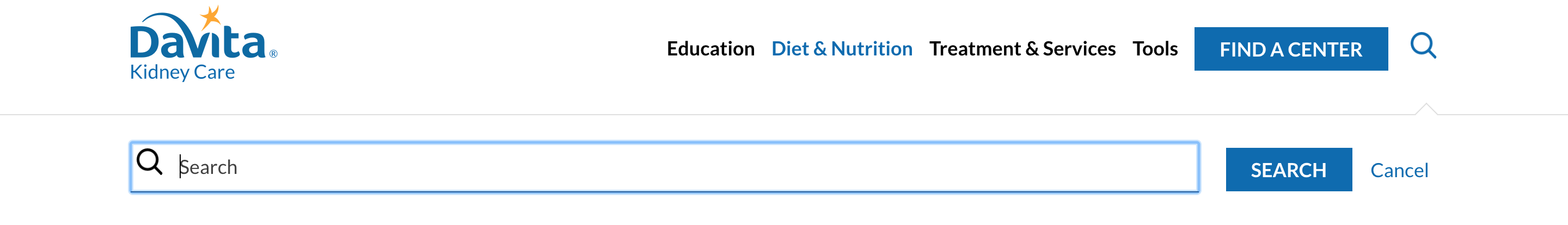
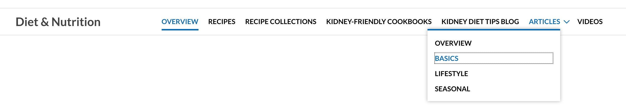
Main Navigation

Main Navigation (Search Bar open)
Main Navigation (Megamenu open)
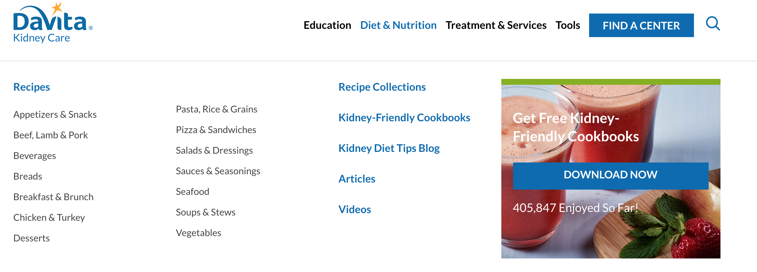
Main Navigation (Sub Navigation)
Utility Navigation

Breadcrumb Navigation

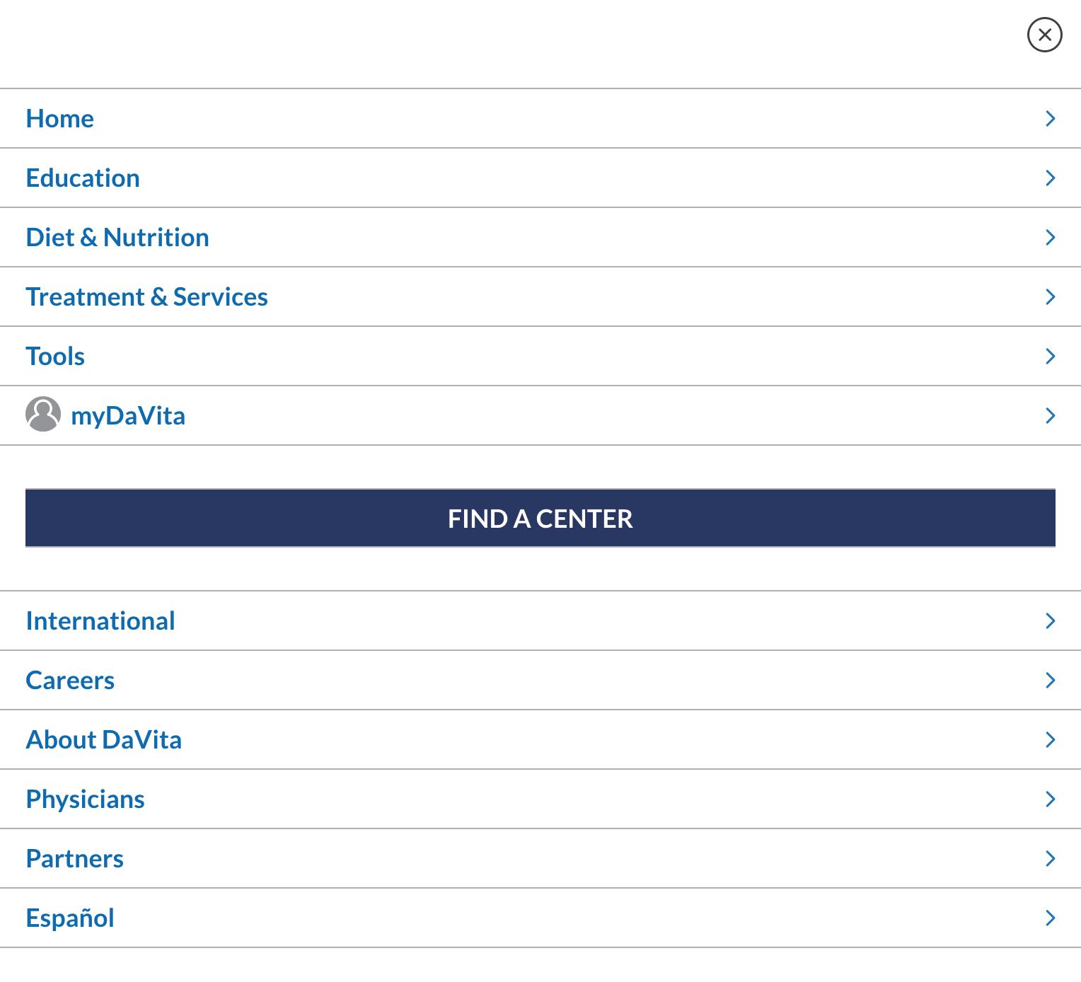
Tablet/Mobile Navigation

Tablet/Mobile Navigation (open)
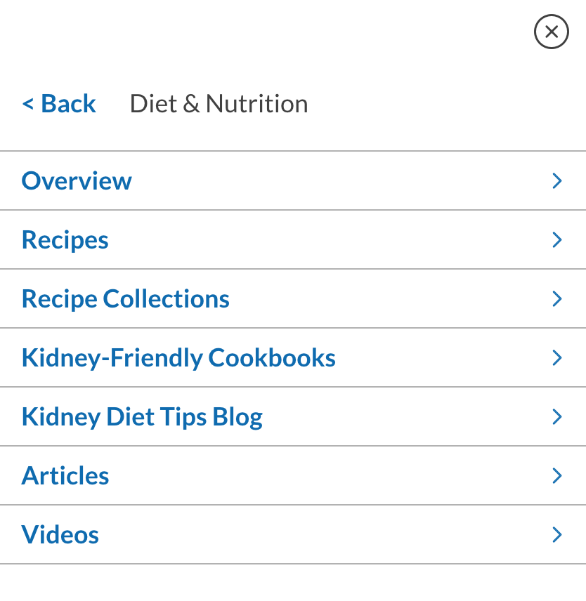
Tablet/Mobile (Sub Navigation)
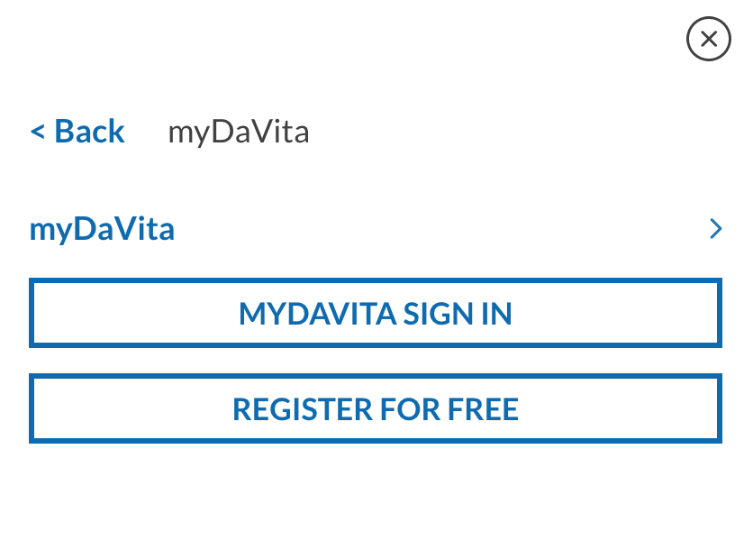
Tablet/Mobile myDaVita Navigation (Not logged in)
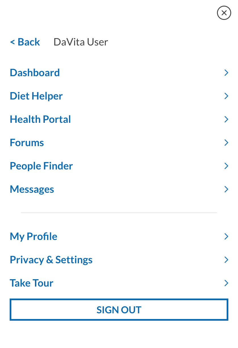
Tablet/Mobile myDaVita Navigation (Logged in)
Graphical Elements
Footer - Social Icons
These icons, featured in the global footer, link to the various DaVita social channels.
Sample Global Components
Below is a small sampling of some of global components used throughout the DaVita Kidney Care website.
Action Tile - Border Variant
The Action Tile Box Border variant consists of a headline, descriptive text and a CTA. These may also feature a location text input where a user can input a zip code for finding a class or center. These are predomninantly used in the right rail content well as supplementary content.
Manage Your Kidney Care
From your phone to your laptop, myDaVita can help you understand all aspects of your condition.
Action Tile - Two Tone Variant
The Action Tile Two Tone variants consists of a headline, descriptive text and a CTA. This a themeable component so a content author can select a color pairing for the top and bottom portion of the component. These are predomninantly used in the right rail content well as well as in the Two Column Band as supplementary content.
Corporate Responsibility
Take a closer look at our Trilogy of Care—caring for our patients, caring for each other and caring for our world.
Two Column Band - Action Tile Two Tone
The Two Column Band is used at the bottom of pages and features two content wells that are filled by Action Tile Two Tone variants.
DaVita Diet HelperTM
Plan and track meals, create shopping lists, access dining-out guides and more.
Kidney Diet Tips Blog
Get the latest nutrition tips and suggestions provided by DaVita dietitians.
Image Tile
The Image Tile consists of a background image, headline, descriptive text and a CTA. The Image Tile is a themeable component and can have its top border changed to match the color scheme of the section in which it appears. They are predomninantly used in the right rail content well.
Get Free Kidney-Friendly Cookbooks
Deeper Look Tile
The Deeper Look Tile consists of an icon, headline and descriptive text. This is a themeable component and the content author has the ability to select from a multitude of color themes which will change the background of the top portion of the component. These are usually found in a grid and are used to drive the user to tertiary pages within the section.
Curated Accordion
The Curated Accordion is found on several level 2/3 landing pages and is made up of Accordion Blocks. Each block contains a headline, subhead and content wells for Band Icon Blocks as well as the Video Player Block. Each Band IconBlock is a hyperlinked icon and descriptive text that drives a user to tertiary (or deeper) content within thesection. The Video Player Block is a YouTube embed that allows for descriptive text below the video.
Kidney Knowledge
Take control of your health by learning all you can about the late stages of kidney disease.
 Take a Kidney Disease Education Class
Find an educator-led Kidney Smart® class in a neighborhood near you.
 Learn About Stage 4 of Kidney Disease
Kidney disease comes in stages. If you're in stage 4, learn how to prolong kidney function.
 Know About Stage 5 of Kidney Disease
It's time to look at your treatment options. Learn what they are when you have stage 5 CKD.
 How Does Dialysis Work?
This video explains how dialysis helps millions of people every day.
5 Steps to Take When Diagnosed With Late Stage Kidney Disease
Learn the steps to take if diagnosed with late stage kidney disease.